


Part with living by excellence, the living room is a cozy, cocoon where we find ourselves and where we should feel good.
All decoration are possible in a room, provided you choose the right color tones side.
Not too cold, not too flashy, you have to find the right measure to create harmony and avoid errors of taste.
So when color is synonymous with good humor the whole drafting Royal Art Palace which mobilizes to boost your interior.
Let's explore the different existing tones and follow our tips to use at best.
Warm color, cold or neutral?
Colors influence our behavior because they are charged with a strong emotional value.
Some boost us while others soothe us immediately.
But how to find and make the right choice of colors ?
In the color wheel, also called color wheel, warm shades are on the left while cool shades are on the right side.
There are also intermediate shades which are placed between the two groups and that may belong to one or the other depending on the dominant notes of which they are made (eg green and purple variants).

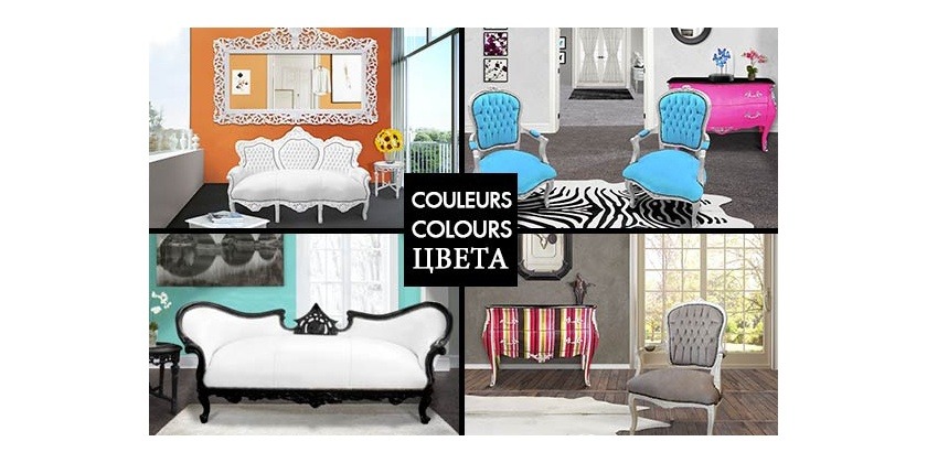
Warm colors are red, orange, yellow and beige.
They are associated with well-being, energy, joy.
They bring warmth and comfort to a room and transform it into a place of sharing and conviviality.
They are perfect for family rooms or reception where good mood as the kitchen, living room, dining room.
But be careful, you should use warm colors harmoniously.
Indeed, their intensity can quickly saturate a place so avoid the total look of sunny shades.
Warm colors therefore need to be balanced with tones and cool materials with which they go great as the polished concrete floors, concrete walls, a steel worktop or a wrought iron furniture.

Furniture from Royal Art Palace
Blue, green and purple are defined as cold colors.
They are associated with calm and serenity.
Their soothing colors make them ideal in rooms where you want to recharge.
If your room for you a relaxation and wellness, choose fresh shades of blue or green water.
But if you want to warm the atmosphere, combine the cool colors in warm materials like wood floors, linen curtains or wool cushions for a cocooning atmosphere.
Color temperature also affect the feeling of space and cool colors help to enlarge the space while warm colors give a feeling of constriction and create a much more intimate universe.

Furniture from Royal Art Palace
A neutral color can range from bright shades such as cream or white to the darker shades, like chocolate or coal.
They are the basis of the background in the decoration of an interior.
Rather conventional, they go through periods remaining in the air.
The decorations with neutral colors are soothing, relaxing and very elegant as these tones demonstrate subtlety and delicacy.
The decoration based on neutral colors can also be decorated in bright or dark colors. Thus, with a neutral backdrop feel free to use decorative items or a colorful section of wall with this tone because you can play the card of audacity.
In addition, neutral hues agree as well with warm colors with cold colors.

Furniture from Royal Art Palace
Playing on the color with the furniture and accessories
You want to revamp your living room, to give it a touch of fantasy and cheerfulness without changing the color white walls ? It's possible !
Sprinkle your room with colorful elements here and there.
Choose one or more turquoise colored furniture or seduced by fuchsia chairs.
If you dare not put colored furniture at home because you're afraid of tiring you, multiply cushions and flashy accessories.
So you can change your decor to suit your needs !
In total look or in small steps, you can be sure (s) your room will be transformed.
There will emerge a more cheerful atmosphere and in your living room will become an instant personal, warm and welcoming.
This is proved, you put more color into your home and your mood will be in good shape! So why not use it ?

Furniture from Royal Art Palace
Did you know?
Founded in 1866 and known for its universal color chart, the Pantone company unveiled every year the color that will mark the coming year.
To select THE color of the year, Pantone travels the world in search of the most influential colors.
The goal? Find colors that will influence the world of creation (designers to fashion designers).
But for the first time, Pantone has chosen not one, but two colors of the year.
For 2016, the Rose "Quartz" and "Serenity" blue are featured.
Both subtle and complementary, they represent a perfect balance.
Their alliance creates an oasis of peace, comfort and sharing.
To join them or choose single color, two colors are placed under the sign of softness and simplicity, falling within the category of pastel shades.

©Tollens - G.Gardette
Related Posts:
- Gift Ideas for Her & Him 25 b 2024
- Very decorative gifts for teens ! 25 b 2024
- Christmas 2016 : the favorites of the editorial 25 b 2024
- 6 ways to decorate your fireplace 25 b 2024
- Focus on bed's end 25 b 2024
- Simmer your decorating for Halloween 25 b 2024
Leave a Reply Cancel Reply